SWEET BABY RAY'S Gourmet Sauces Rebrand
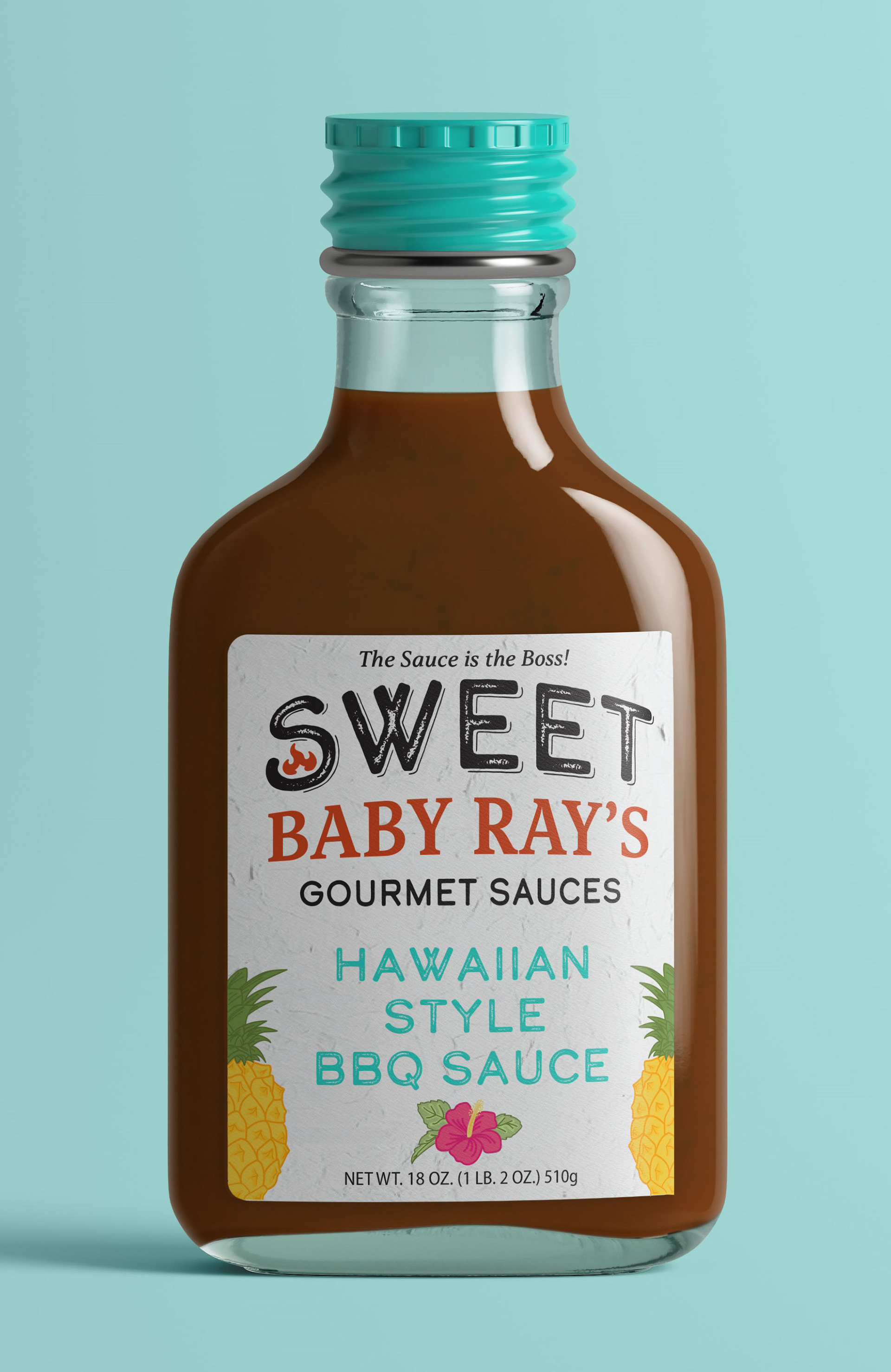
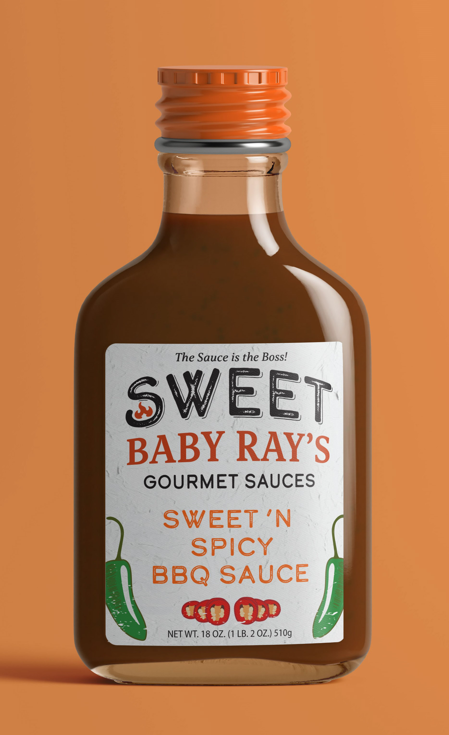
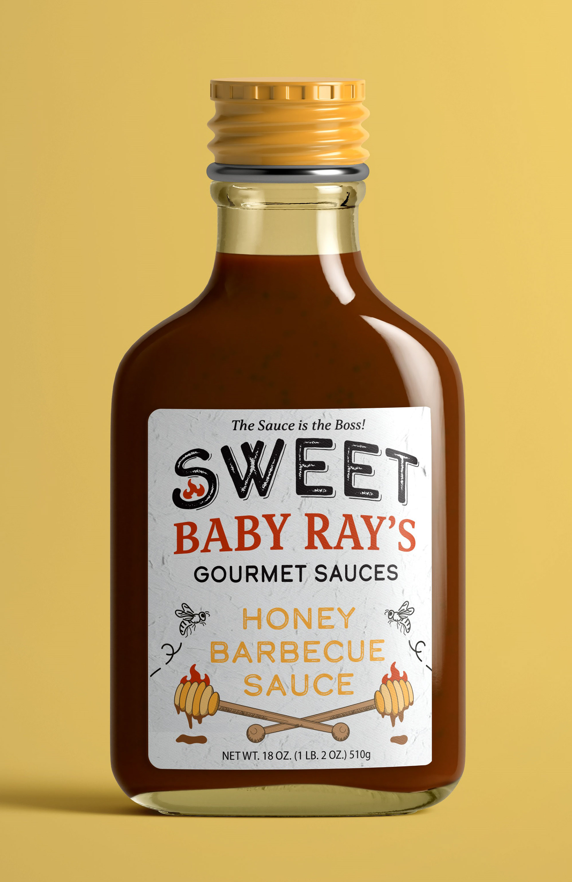
For my rebranding project, I chose to go with Sweet Baby Ray's Gourmet Sauces. The rebrand focuses on bringing variations of color, unification, and weighted symmetrical illustrations into the design elements. The labels feature bold color elements with a lighter overall tone to separate them from its competitor's two to three dark-themed containers.
The original product logo/ labels are very simplistic with little variation between each flavor choice besides high contrasting colors for each flavor, aside from minor illustrations at the bottom. The main logo is small and subtle with a classic serif and sans serif combination. Whereas for the rebrand, I felt it was necessary for the type to make more of an impact by incorporating a block-like logo shape. The distressed type adds character to a pop of color.


With each container's cap coinciding with its flavor's contents, consumers will be able to swiftly identify their desired item on the shelf of a grocery store at a quick glance compared to its competitors with all uniform seals or caps.