New Company Packaging Project
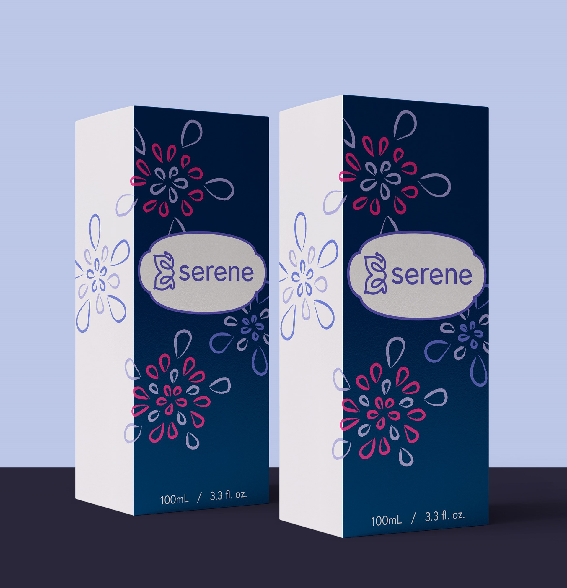
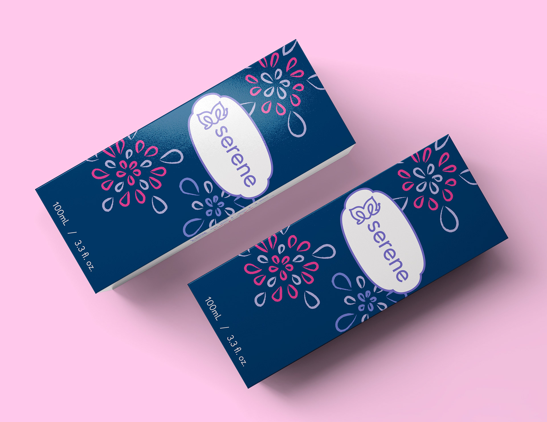
For my new company project, I chose to package a perfume brand, Serene Fragrance. The company's packaging focuses on details of high contrast with an analogous color palette. The added vibrancy helps stimulate the customer, adding a bit of excitement when purchasing the product, while its packaging remains tranquil and serene overall.
The Serene Fragrance logo focuses on simplicity and evenly balanced linework throughout. The typeface itself, Europa-Regular (Regular), is an all-lowercase, rounded design to give off that eased, modern feeling. The half-closed butterfly icon features more of that light and airy concept that customers admire when purchasing a perfume. Both aspects complement each other, while the purple color of the logo offers a bold and memorable impact.


The box's packaging features high contrasting colors with "sprits" of Serene perfume on most sides of the box. This design sets expectations for the customer about the product and incorporates a floral and starburst-like aspect for a more feminine appeal. The product's packaging invites the customer to the idea of everyday use or a night out with friends/ someone special.